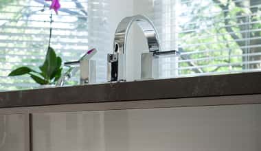
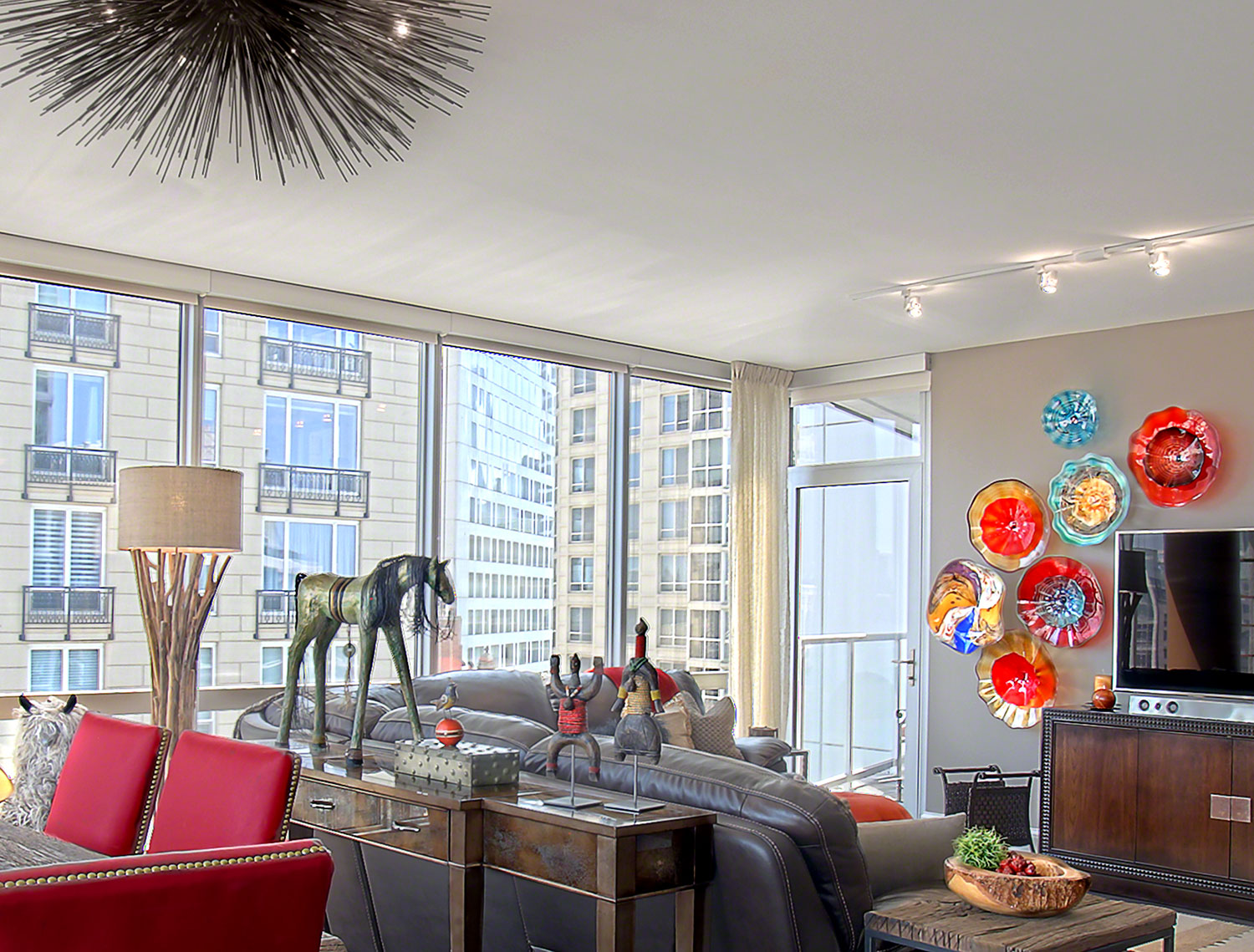
How to Brighten Up an Urban Condo
Neutrals are still hot for home interiors, and always will be, but some of my clients are crazy about color, and so am I! Dialing up the color can make your home cheerful, exciting, energizing – choose any mood you like! You don’t have to go full-rainbow to achieve your goals, though I wouldn’t object! Don’t you love the range of colors in the Chicago condo below, left? For a unified look, I pulled the reds, oranges and blues from the Viz Art Glass wall installation into the accessories.
Not only do these clients love color, they enjoy unusual, whimsical art and furnishings. They wanted a fun-loving space for this pied-a-terre in the city where they escape for kicked-back weekends with the married kids and grandkids. Of course, you don’t have to introduce color in every room. My clients who love color often want a space or two that are more understated and relaxing.
Make Color Changes Easy
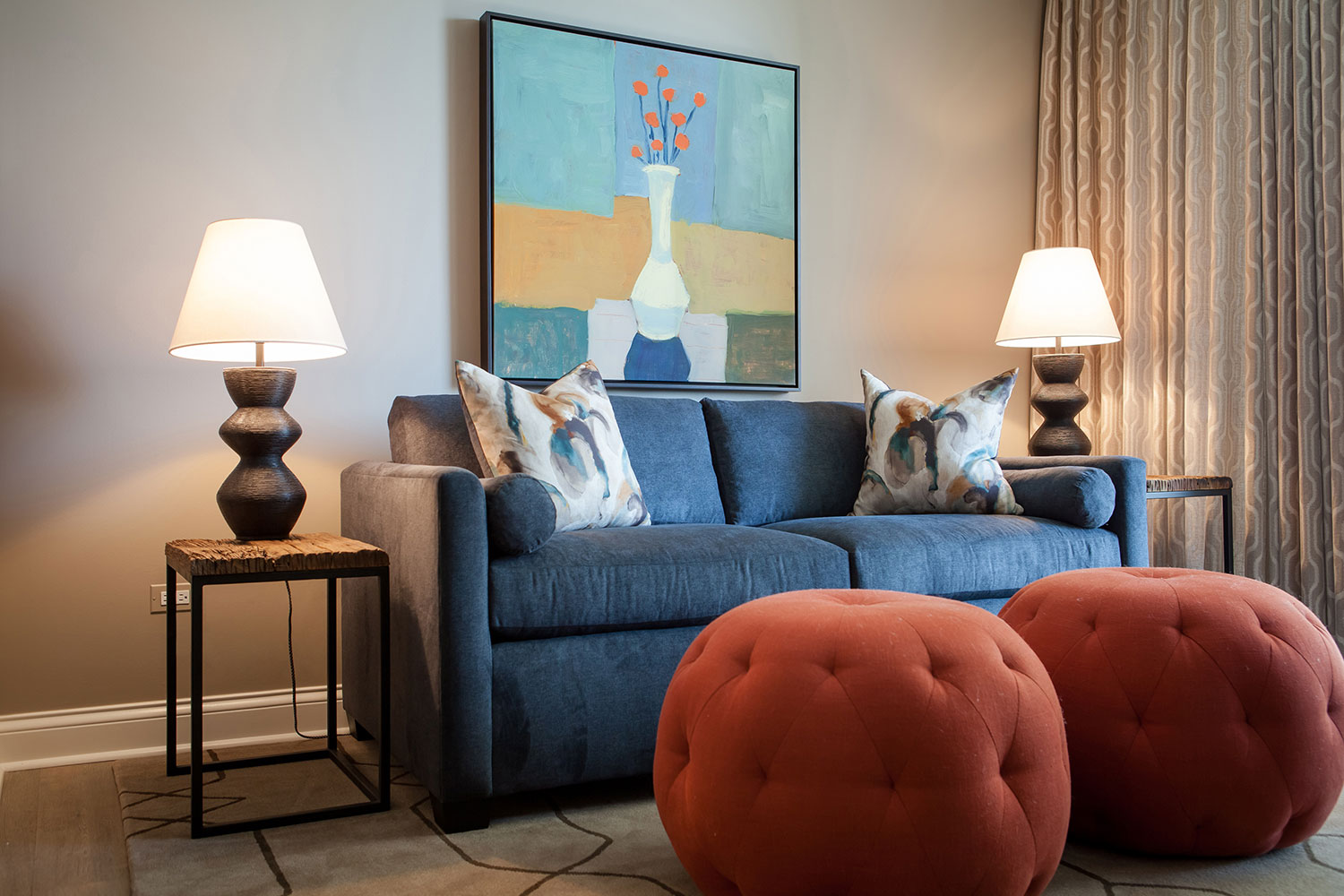
Big, pumpkin orange ottomans might be a little scary for some, but aren’t they great in the study above? I love bringing something unexpected to a project! The color palette is drawn from the piece of art, which makes the orange and blue furniture feel right at home. For the custom pillows from Style Library, I combined the colors of the artwork.
A few neutral pieces – the side tables, lamps, rug and window treatments balance the energy in the room, and so does the wall color.
Do you like to update your palette periodically? In this room it’s easy. Start with a new piece of art and reupholster the ottomans and the throw pillows. Everything else can stay the same.
Match the Colors to the Space
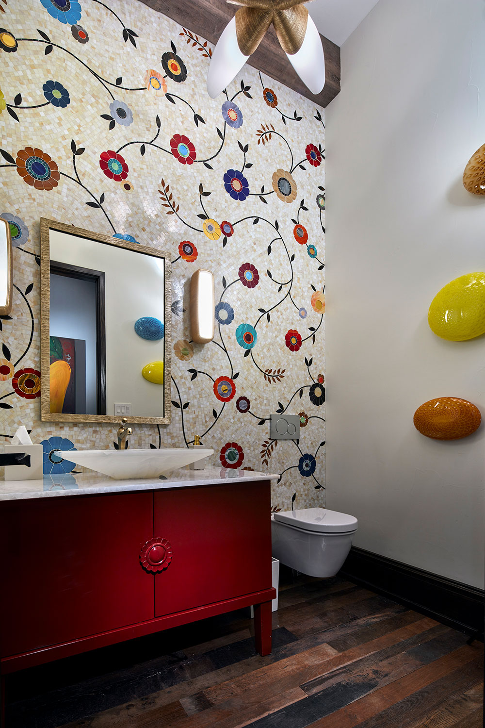
Because this powder room is located near my client’s outdoor pool, I recommended a plunge into free-wheeling color and pattern. Isn’t this playful? Believe it or not, this accent wall is a custom glass mosaic tile installation from Artistic Tile with thousands of individual pieces. I’m glad I wasn’t the one who had to install it. Ha! The red vanity anchors the space while the white countertop and onyx sink from Stone Forest provide contrast. Powder rooms are a great place to let your imagination run wild. They tend to be small and much less used than kitchens, bedrooms or full baths.
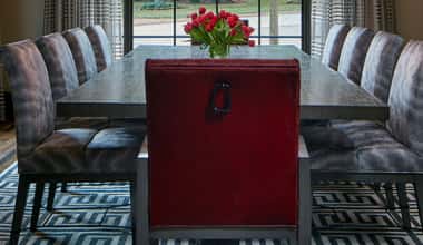
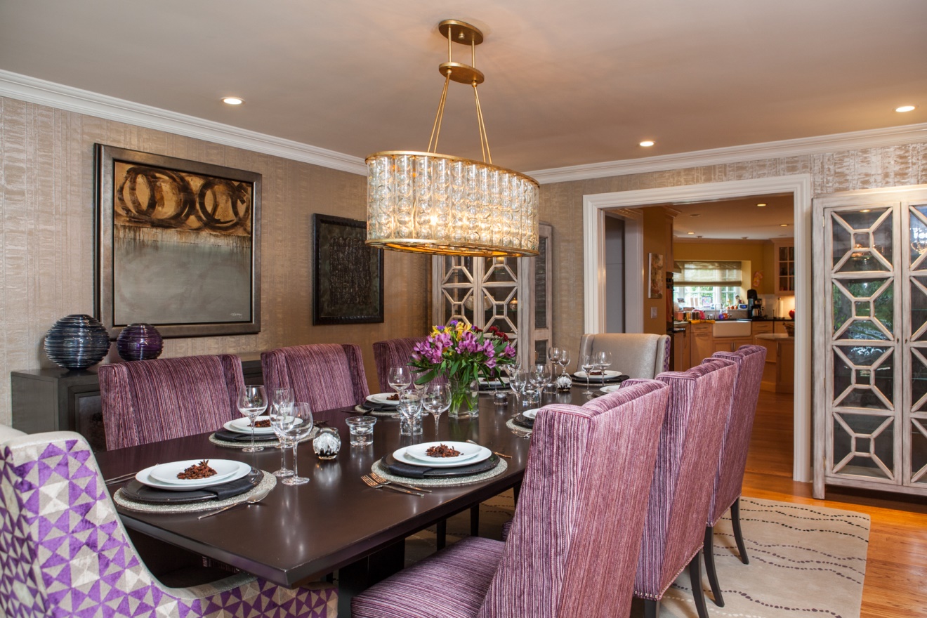
Why a Purple Dining Room?
I always think of purple as combining the calming quality of blue with the bold energy of red. That may sound like a mixed message, but to me it seems like the right one for a dining room. We want our guests to be relaxed yet excited about the food and beverages we serve and the conversation we inspire. For extra interest, I mixed fabrics to highlight the head chairs and to introduce a geometric pattern that plays into the strength of purple. Imagine the lively discussions you might have with guests around this table! Click to see more of this spectacular colorful dining room.
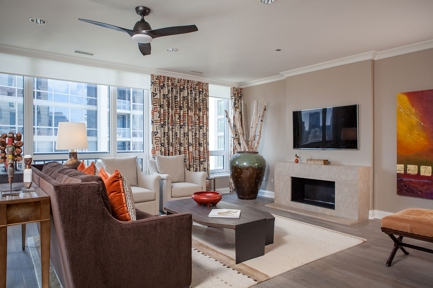
Tips for Warming Up a High-Rise Condo
These wonderful clients love the colors and patterns of their modern tribal condo in Chicago. The oranges and reds warm up this great room, which overlooks urban high rises. The embroidered, geometric window treatments were the jumping off point for the color palette of the art and accessories throughout the room. My clients’ gracious lifestyle and open-door policy to friends and family were the jumping-off point for the welcoming vibe that permeates my clients’ second home.
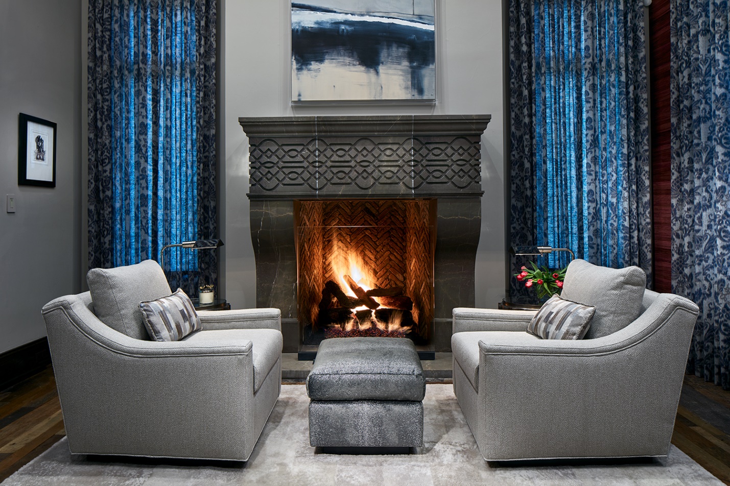
Why Dial Down Color for Master Bedroom?
Of course, you can always choose bright colors for your master bedroom, but most of my clients want a more subdued, calming palette when they’re getting ready to sleep or just opening their eyes in the morning. But that doesn’t mean you have to stick to neutrals. These regal blue window panels supply floor to ceiling color without making a lot of “noise.”
Color Your Home Office with Personality
Don’t the colors and patterns of this home office tell you something about the occupant? You might guess a vivacious, fun-loving female who is laid-back but also a bit of a risk-taker. You would be right! Not everyone would be willing to combine multi-colored polka dots with red and white plaid and an ottoman wrapped in red balloons. This palette blends beautifully with the rest of her home, where I chose the client’s favorite reds to accent many rooms. Notice how I balanced all that color and pattern with the understated second fabric on the wings and arms of the chairs? It’s important not to overdue a good thing.
I always encourage my clients to let their personalities shine in their home offices. You will feel better about going to work every day, and that will make you more productive. Check out more of my ideas for home ideas in one of my earlier blogs, Optimizing Your Home Office.
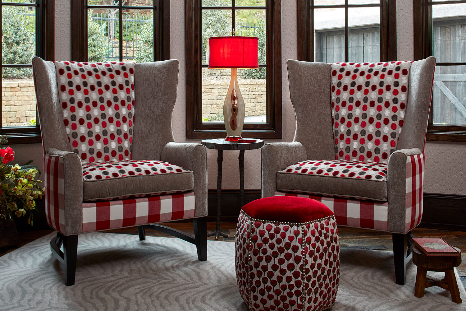
Home offices don’t have to be buttoned-down and boring. Check out these chairs from Charles Stewart Company. Photo by Brian Gassel.
Are You Getting Excited About Color at Home?
I would love to chat with you about how to dial up the color in your home. If you’re ready, we can connect via email, phone, video call or in-person meeting.